

Design guide
The Best Fonts for Outdoor Signs
A font that looks attractive on a phone screen may fail when carved, painted and viewed from across a yard. Outdoor lettering must balance personality with strong strokes, open spaces and clear hierarchy.
Expert guidance
What you should know
A font that looks attractive on a phone screen may fail when carved, painted and viewed from across a yard. Outdoor lettering must balance personality with strong strokes, open spaces and clear hierarchy.
Start with viewing distance
The farther away the sign will be viewed, the bolder and simpler the main lettering should become. Small decorative text should never compete with the family or business name.
Use script selectively
Script can add warmth, but connected strokes and tight loops may become fragile. Use script for one emphasized line and pair it with a simpler secondary typeface.
Serif fonts
Traditional serif styles work well when the serifs are substantial rather than hairline-thin. They are useful for classic family, farm and memorial signs.
Maker’s advice: Send us a photo of the installation area, finished dimensions and exposure details. Material and design recommendations are much more accurate when we can see the actual space.
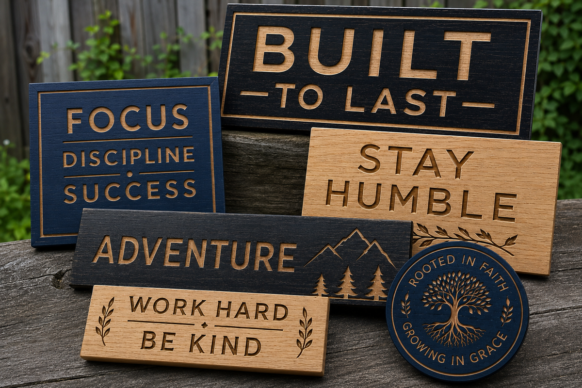
one universal engraving font
Sans-serif fonts
Bold sans-serif lettering offers excellent readability and a modern appearance. It is often the safest choice for business names, addresses and information that must be read quickly.
Quick comparison
At-a-glance comparison
Use this table as a starting point. Your finished size, exposure and installation can change the recommendation.
| Style | Best use | Avoid |
|---|---|---|
| Bold sans serif | Business names and long viewing distances | Ultra-condensed lettering |
| Substantial serif | Traditional family and farm signs | Hairline serifs |
| Moderate script | Names and short decorative phrases | Tiny loops and very thin connectors |
| Display lettering | Short headlines and themed signs | Long paragraphs in novelty fonts |
Planning details
Put the advice into practice
Strong outdoor signs come from combining the right material, readable design, compatible finish and secure installation.
Spacing matters as much as font choice
Letters that touch or nearly touch can merge after carving and paint. Adjusting kerning, line spacing and internal openings is part of preparing artwork for CNC production.
Common questions
Frequently asked questions
Can I use any font I find online?
The font must be licensed for commercial use and suitable for carving at the selected size.
Can you make thin script stronger?
Often yes. We can thicken strokes, simplify loops and adjust spacing while preserving the style.
How many fonts should a sign use?
One or two coordinated typefaces are usually enough. Too many styles reduce hierarchy.
Why does my proof look different from typed text?
We may modify spacing and stroke thickness so the design can be carved and finished reliably.
Ready to plan your custom sign?
Tell us where the sign will be installed, how large it needs to be and what style you have in mind. We will help match the material and design to the project.